Charting The Liquidity Trap: The Deleveraging Cycle Has Just Begun
September 18, 2012
by: Plan B Economics
.
The term "liquidity trap" sounds like a nebulous reference to a meaningless economic paradigm; or an excuse to confuse the layman. But to understand that we are in a liquidity trap is to understand the economic chasm we must cross today. It is to understand why central banks around the world are powerless, yet will continue to pump trillions into the global markets.
In summary, a liquidity trap describes the situation in which new money entering an economy (e.g. via central bank money printing) is sucked back into the banking system as deposits, thereby having little effect on real economic activity.
.
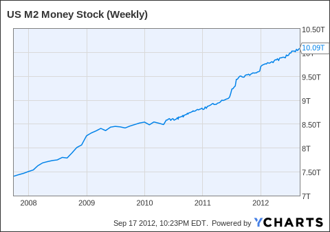
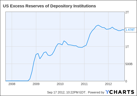
The liquidity trap can be visualized using the following two charts. Chart 1 shows the new money entering the financial system, while Chart 2 shows the growth in excess depository reserves.
In other words, money is entering the system, but is cycled back to financial institutions and the Federal Reserve as deposits. Consequently, expansionary monetary policy is ineffective as new money is not leading to growth in final aggregate demand.
(click images to enlarge)
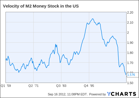
Another way to demonstrate the impotence of monetary policy is to look at the speed at which money cycles through the economy -- money velocity. This is simply another way to show how likely people (and businesses) that receive cash are to store it in a bank deposit (i.e., it measures the strength of a liquidity trap).
Currently (chart below), money velocity is at a record low, suggesting the liquidity trap is stronger than at any time during the last 40+ years.
.
So why are we in a liquidity trap? Why are people and businesses (even financial institutions) socking away every penny they get?
.
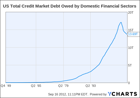
Take a look at the following two charts. The financial sector and household sector are deleveraging. This is a rare occurrence, but the declining use of credit in these sectors suggest participants are trying to shrink, build fortress levels of capital and/or don't see profitable opportunities.
This is precisely what happens after an economy extends beyond its normal capacity. Until the 2008 collapse, we were simply buying too much stuff, employing too many people and living far beyond our means. Now it's payback time -- reversing a credit bubble takes years of painful deleveraging. This is why we're in a liquidity trap.
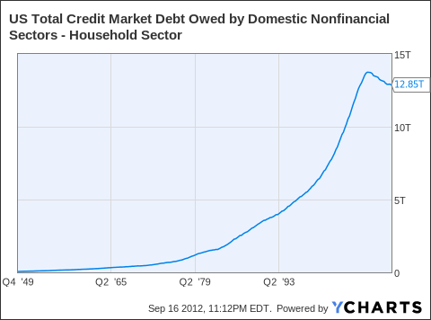
US Total Credit Market Debt Owed by Domestic Nonfinancial Sectors - Household Sector data by YCharts
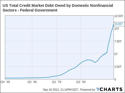
Given the liquidity trap and deleveraging household and financial sectors, what's keeping the economy from totally imploding?
Answer: the massive expansion of government debt (chart below). By pumping money into the liquidity trap, central banks are keeping the system alive. But central banks -- by buying bonds -- are indirectly monetizing government debt keeping interest rates low.
We have entered a new status quo, but one should not become complacent. For this new normal comes with massive risks. If the new cycle comes to a stop, governments, businesses and consumers around the world will be in for a massive shock.
0 comments:
Publicar un comentario